History of the Athletics Baseball Hat and Iconic Team Logos
The Athletics are one of the most well known teams in the majors. They are green and gold in color, classically lettered “A” and are known by the iconic elephant logo associated with the brand. The club’s brand has stayed consistent, from Philly to Oakland and on to the present day, Sacramento, while retaining some key elements of the club’s past.
This is tightly linked to that journey, and in the story of Athletics Baseball Hats. Team caps have embodied various cities, time periods, logos, and uniform designs, and have become an integral component of baseball fashion and the fandom.
The Early Years of the Athletics
The story of the Philadelphia Athletics serves as a prime example of the sport’s history.The Philadelphia Athletics is an example of the history of the sport.
The Athletics started their history as one of the founding teams of the American League in 1901. The club spent its first 54 seasons in Philadelphia before moving to Kansas City in 1955.
The team created some graphics during the Philadelphia years that would stick with them for the long haul. The elephant began to feature prominently in the club’s imagery as early uniforms prominently featured the letter “A”.
The team’s name wasn’t just a logo. It symbolized the personality of the franchise and relationship with fans.
How the Famous Elephant Logo Started
From an Insult to a Team Symbol
The Athletics’ elephant has one of the most bizarre backgrounds in pro sports. The Philadelphia club was referred to as a “white elephant” in 1902 by New York Giants manager John McGraw. Athletics owner and manager Connie Mack didn’t take the comment as an insult.
The elephant became the symbol of the team soon after. It then became a feature of publications, memorabilia, uniforms and other Athletics imagery.
This ingenious shift of focus from criticism to pride. It also established a logo that could be easily recognized by fans as the Athletics’.
The Evolution of Athletics Hat Logos
The Classic “A”
The letter “A” has been one of the most significant in the history of Athletics. Easy to understand, identify and is very tied to the team’s nickname.
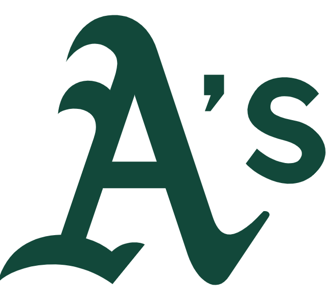
After the franchise relocated from Kansas City to Oakland in 1968, the cap had to be re-branded. The club adopted a “KC” logo for the Kansas City version, but this was switched for a simple “A.” The next season the design was altered once again to the plural “A’s”.
That’s an example of the kind of life that can change as much when something happens on a baseball hat.
The “A’s” Era
The “A’s” lettering became a hallmark of the team and were a common feature of their branding. The simplicity of the design was welcomed by fans, as it could be used on various items such as caps, jerseys, jackets, and other merchandise.
The logo also became the Athletics’ mark to make the West Coast brand recognizable after the relocation in 1968.
Green and Gold turn iconic.Green and Gold become iconic.
A New Oakland Identity
Their green and gold attire was a signature during their Oakland years. Field colors became prominent and were firmly linked to some of the top teams in franchise history.
Oakland went on to create a dynasty in the early 1970s, and claimed three straight World Series championships from 1972 to 1974. The team’s bright green and gold uniforms became inseparable from that successful period of time.
But green and gold Athletics caps were more than just team gear. They were emblematic of championship ball and Oakland sports culture.
The elephant came back.The elephant returned.
The revival of a historic symbol.A historic symbol returns.
During the Kansas City and early Oakland era, the elephant was taken out of the team’s identity. But the symbol once again came back.
The elephant was returned with the purchase of the club by Walter A. Haas Jr. in the late 1980s.
It was a poignant moment. Oakland went to three World Series in their four seasons between 1988 and 1990, and capped it off with a World Series victory in 1989. Another significant success story in the history of the franchise became inextricably linked with the elephant’s return.
Iconic Athletics Hat Designs
Classic Fitted Caps
Fitted caps are still one of the most custom headwear types for representing the team.
The traditional green cap with the Athletics logo can be seen on game days or as everyday wear.
Snapback and Adjustable Styles
Today’s fans are more versatile than ever. The adjustable caps and snapbacks offer wearers the option to adjust the fit while still sporting the team’s brand.
These styles also go well with casual streetwear and thus have a wider acceptance outside the baseball stadium.
Retro-Inspired Hats
Retro caps are popular among baseball enthusiasts and collectors. Logos, colors and championship eras from the past are included in the designs to help tie in with previous generations of Athletics baseball.
They are also a different style of contemporary caps.
The significance of Athletics Logos.What is the big deal about Athletics Logos?
Three elements of a good sports logo are that it is recognisable, adaptable and related to a story. The Athletics have the three.
Each of the “A,” “A’s,” elephant and green-and-gold color combination symbolize different eras in the franchise’s history. In making this identity, they have left behind them the moves and the generations of fans.
Also, the club’s 2026 season is its 125th anniversary, making these symbols the product of many years.
Athletics Baseball Hat Collection.
Purchasing Athletics Baseball Hats may be a good way to delve into the team’s history. Fans don’t have to purchase only the latest trendy designs, they can find caps inspired by different eras.
The box might contain a vintage “A” cap, a green and gold hat, an elephant’s cap, a championship era cap, or a newer adjustable/hat fit cap.
Any of the designs can symbolize a different moment in the franchise’s history.
Final Thoughts
The story of the Athletics hats is more than simply a fashion story. Each of the big logos and designs represents a chapter in the franchise’s long journey.
Whether it was the early “A”s of Philadelphia, the beloved “KC” from Kansas City, the Oakland “A’s” or the iconic green and gold colors, these logos have come to shape one of baseball’s oldest franchises.
Today, “Athletics Baseball Hats” carry on the tradition, enabling fans to reach back into the team’s history while demonstrating their support for its future.